How I Teach Graphic Novel Color Design to Students

Teachers – Grab the FREE STUDENT HANDOUT for this lesson here.


The STUDENT LESSON to accompany the handout can be found here.


Graphic novels stand out for their bold and bright visual artwork. Colorists are the people we can to thank for that!

Colorists are the professionals responsible for adding color to black and white line art. They have knowledge of what we call color theory and color psychology. 

In graphic novels color distinguishes characters and scenes, but it is also has symbolic purposes, to communicate ideas, illuminate essential details, or even evoke an emotional response from the reader.

Discuss How Color Is Used Around the world

Throughout history humans have been using color to represent different feelings and emotions. Indigenous cultures in North America have used color symbolically in their cultural traditions, crafts, and ceremonies. Although each First Nation’s culture, traditions, and history is unique, some there are some shared or common symbolism is associated with colors. Black = power, aggression, strength White = purity, spirit Green = nature, harmony Purple = power, magic


INTRODUCE COLOR PSYCHOLOGY & CULTURE


You may not be aware of it, but color is an incredibly powerful force in our lives. Colors is a strong emotional clue and it effects our bodies and our minds. The study of this effect is called Color Psychology.

As humans, we have learned to associate specific colors with feelings and emotions.

For example,

The color blue is often associated with feeling “blue”.

We associate emotional states like sadness or gloom with the color blue.

Red is often associated with anger.

Now taking color psychology a step further:

We have also learned to associate certain feelings and emotions with temperatures.

Colors like blue, green and purple are what we call “cool” colors.

Reds, yellows, and oranges are considered “warms”.

Colorists are masters at working with these human associations to turn two-dimensional drawings into vivid stories that feel real and influence our emotions.

The colorists make their color choices depending on how they want the audience to perceive the world or characters.

 
A colorist might use blue tones to create a cool, calming effect.  Or they might use shades of red to emphasize the anger of two characters in a heated argument.

Examples of Color Use

First is an example from the graphic novel This One Summer by Mariko Tamaki & Jillian Tamaki.   Purple and blue are the only colors used throughout the graphic novel. The novel is a coming of age story and that takes place over the summer in a small beach town.   The choice of blue and purple colors develops the cool and laid back feel of the summer time. The characters are often swimming in the ocean and staying up late watching the night skies.   Additionally, the cool color choices represent the emotional and mental health struggles of the main characters.
 
https://www.amazon.ca/This-One-Summer-Mariko-Tamaki/dp/1554981522
 
This next example is from two different graphic novel adaptations of William Shakespeare’s A Midsummer Night’s Dream. The first graphic novel is adapted by John McDonald and illustrated by Kat Nicholson.  The cover has an explosion of bright and bold colors. With neon blues and purples, to glowing reds and yellows. The over the top mix of colors mirrors the high energy chaos of the plot. Characters cast spells, transform into animals and fairy kings and queens argue and play cruel ticks on each other.
 
Notice how the color purple seems to pop of the page in both of the adaptations. The color purple is commonly known for its imagination and mystery. Often used to depict magic and the supernatural.
The second adaptation of A Midsummer Night’s Dream by Nel Yomtov is illustrated by Berenice Muniez. You can see that Muniez has used bright bold colors to draw the readers attention to the supernatural elements in the story. The color purple is used again to highlight the supernatural elements in the story.


COLOR THEORY 101

Color Theory is the rules and guidelines about how colors look and work with other colors. Certain colors harmonize well with other colors and artists, designers and colorists aim to incorporate this harmony into their work.
3

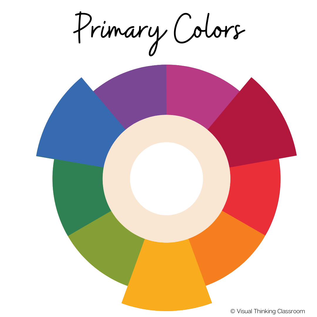
A color wheel or color circle is an illustrative organization of color and it is how designers, artists, and colorists find the perfect combination of colors.
4

There are 12 main colors on the color wheel, and they can be split into three groups: primary colors, secondary colors, and tertiary colors.
5
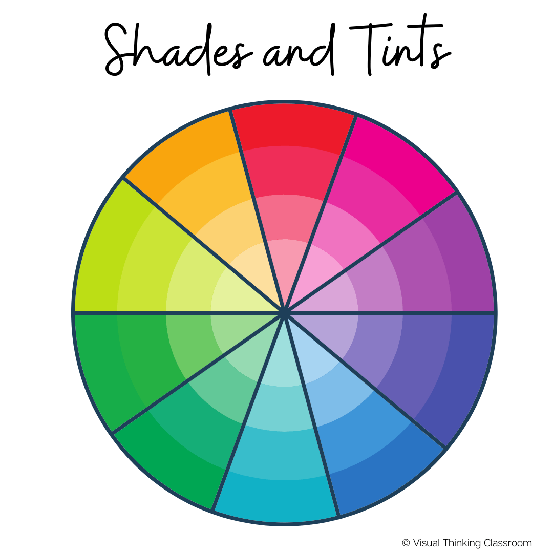
Shade is created by adding black to a color and darkening it. This creates a deeper, richer color. Shades can be quite dramatic and overpowering. A Tint is created when a color is mixed with white, which makes it lighter and more pastel.

HISTORY OF THE COLOR WHEEL